
Matplotlib
针对python不显示汉字解决方案
import matplotlib.pyplot as plt
plt.rcParams[‘font.sans-serif’]=[‘SimHei’]
- 在绘图结构中,figure创建窗口,subplot创建子图。
- 所有的绘画只能在子图上进行。plt表示当前子图,若没有就创建一个子图。
- Figure:面板(图),matplotlib中的所有图像都是位于figure对象中,一个图像只能有一个figure对象。
- Subplot:子图,figure对象下创建一个或多个subplot对象(即axes)用于绘制图像。
配置参数
- figure: 控制dpi、边界颜色、图形大小、和子区( subplot)设置
- font: 字体集(font family)、字体大小和样式设置
- grid: 设置网格颜色和线性
- legend: 设置图例和其中的文本的显示
- line: 设置线条(颜色、线型、宽度等)和标记
- savefig: 可以对保存的图形进行单独设置。例如,设置渲染的文件的背景为白色。
- xticks和yticks: 为x,y轴的主刻度和次刻度设置颜色、大小、方向,以及标签大小。
线条相关属性标记设置
- 线形:linestyle或ls
- ‘-‘ : 实线
- ‘–’ : 虚线
- ‘None’,’ ‘,’’ : 什么都不画
- ‘-.’ : 点划线
- 点型:maker
- ‘o’ :圆圈
- ‘.’ :点
- ‘D’ :菱形
- ‘s’ :正方形
- ‘h’ :六边形1
- ‘*’ :星号
- ‘H’ :六边形2
- ‘d’ :小菱形
- ‘_’ :水平线
- ‘v’ :一角朝下的三角形
- ‘8’ :八边形
- ‘<’ :一角朝左的三角形
- ‘p’ :五边形
- ‘>’ :一角朝右的三角形
- ‘,’ :像素
- ‘^’ :一角朝上的三角形
- ‘+’ :加号
- ‘’ :竖线
- ‘None’,’ ‘,’’ : 无
- ‘x’ :X
颜色:
b:蓝色
g:绿色
r:红色
y:黄色
c:青色
k:黑色
m:洋红色
w:白色
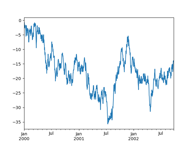
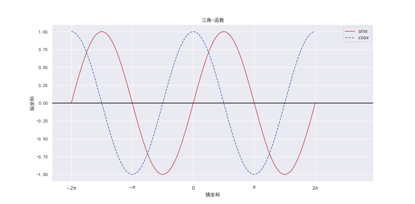
1、线图 plot()
1 | import numpy as np |
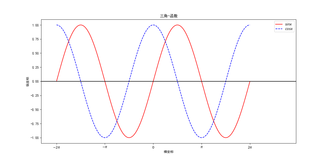
** plot()参数**
- plot([x], y, [fmt], data=None, **kwargs)
- 可选参数[fmt] 是一个字符串来定义图的基本属性如:颜色(color),点型(marker),线型(linestyle),
- 具体形式 fmt = ‘[color][marker][line]’
- fmt接收的是每个属性的单个字母缩写,例如:
- plot(x, y, ‘bo-‘) # 蓝色圆点实线
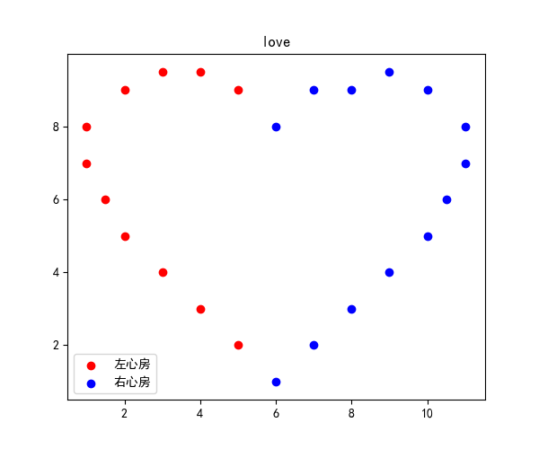
2、散点图
1 | # 散点图 |
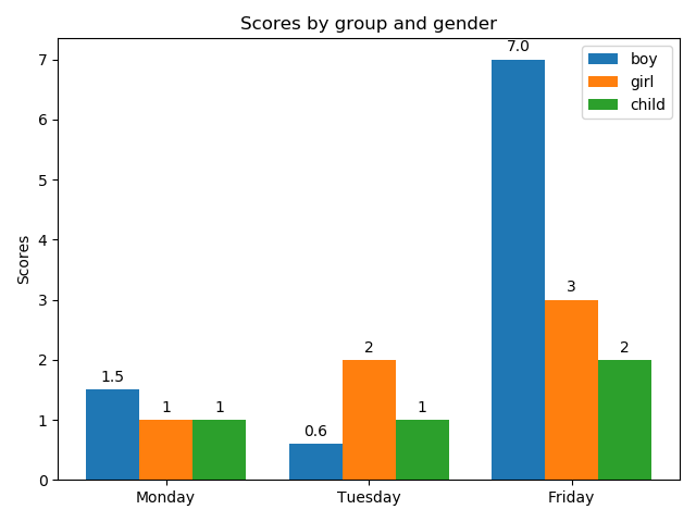
3、条形图
1 | import matplotlib |
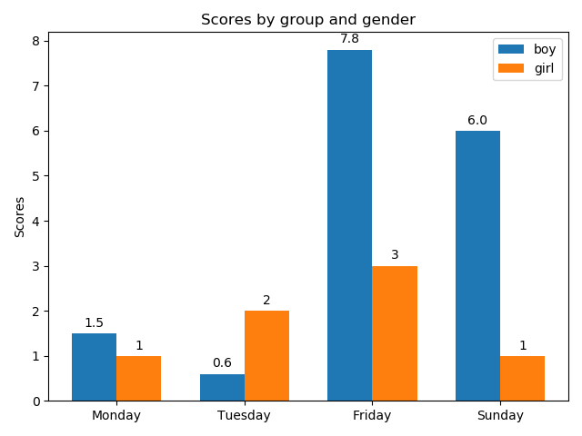
1 | import matplotlib |
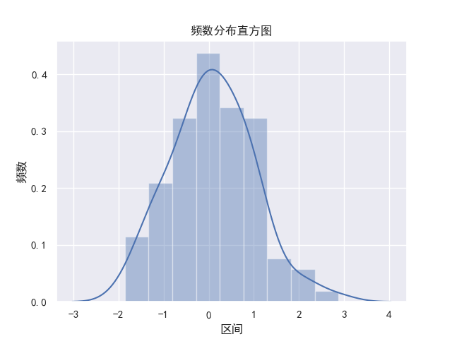
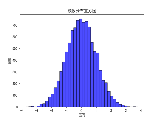
4、直方图
直方图与条形图基本类似,不过直方图通常用来对单个数据的单一属性进行描述,而不是用于比较
- data:必选参数,绘图数据
- bins:直方图的长条形数目,可选项,默认为10 normed:是否将得到的直方图向量归一化,可选项,默认为0,代表不归一化,显示频数。normed=1,表示归一化,显示频率。
- facecolor:长条形的颜色
- edgecolor:长条形边框的颜色
- alpha:透明度
1 | import matplotlib.pyplot as plt |
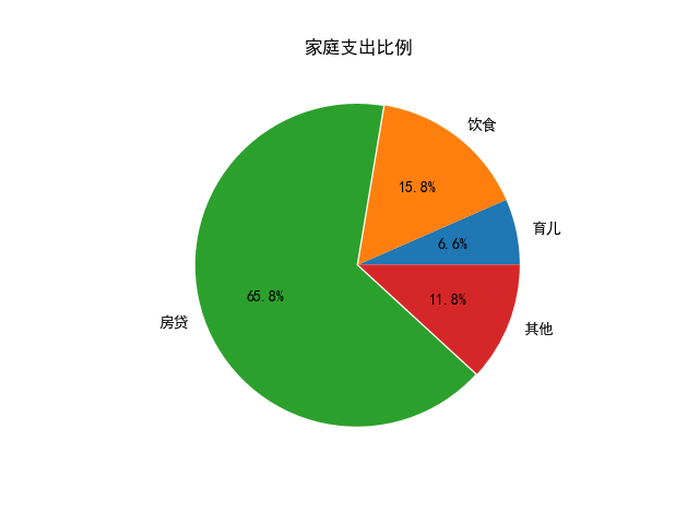
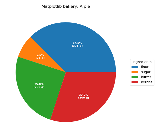
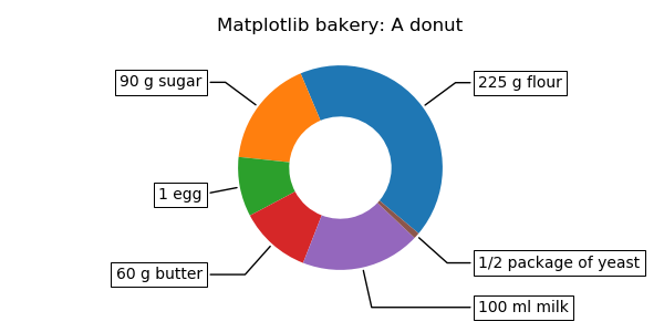
5、饼图
- x :(每一块)的比例,如果sum(x) > 1会使用sum(x)归一化;
- labels :(每一块)饼图外侧显示的说明文字;
- explode :(每一块)离开中心距离;
- startangle :起始绘制角度,默认图是从x轴正方向逆时针画起,如设定=90则从y轴正方向画起;
- shadow :在饼图下面画一个阴影。默认值:False,即不画阴影;
- autopct :控制饼图内百分比设置,可以使用format字符串或者format function ‘%1.1f’指小数点前后位数(没有用空格补齐);
1 | import matplotlib.pyplot as plt |
1 | import numpy as np |
1 | import numpy as np |
Seaborn
1、线图plot()
1 | import numpy as np |
4、直方图
1 | import numpy as np |